

Community Spotlight | January 26 | People, HTML & Transportation Dashboards
- Mar 24
- 2 min read
Welcome to the January 2026 Power BI Community Spotlight!
This month’s picks focus on pushing the technical boundaries of Power BI—from cognitive design principles and HTML-driven interfaces to custom radial visuals and deep operational transport data.
Let’s dive in!
1. People Analytics Executive Hub - nayarahellen

A cognitive design-focused HR dashboard built for executive-level clarity.
Brilliant use of white space and a vibrant color palette that makes KPIs pop
Full of narration with dynamic text explaining workforce stability
Small interactions and navigation buttons for Hiring, Retention, and Diversity
Provides a brilliant executive hub summary of the entire organization
2. Microsoft Products Using HTML - GusFellquexs
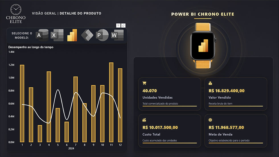
A creative UI exploration that leverages HTML to create a web-like experience.
Uses the HTML Content visual to build a custom interface on the canvas
Moves away from the standard Power BI grid for a polished, modern look
Seamless integration of CSS for sleek navigation and interactive elements
Demonstrates how to transform a report into a professional app-like experience
3. Custom Radial Chart in Power BI - brunobattaglia

A technical showcase of sophisticated custom visualizations for high-precision tracking.
Features an amazing radial chart to visualize performance across categories
Clean, focused layout that tracks completion percentages without clutter
Technical implementation that demonstrates the power of custom visuals
The author also provided the .pbix file for others to explore the back-end logic
4. UK National Rail Transport - HuynhTanPhatT

A highly detailed operational project analyzing six months of national rail data.
Connects passenger demand and revenue to on-time performance and incidents
Includes a full data dictionary, behavior operation, and route analysis
Intuitive use of drill-throughs to move from national overviews to station details
The .pbix file is available for a deep dive
That’s a wrap for the January 2026 Community Spotlight.
See you next month with another batch of inspiring dashboards from the community!


